Buttons UI Kit for Figma
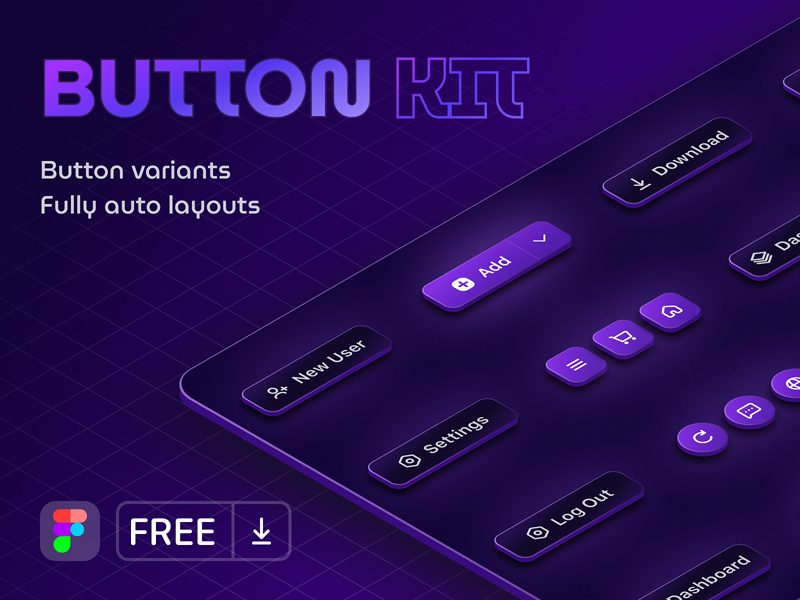
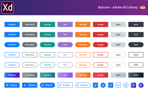
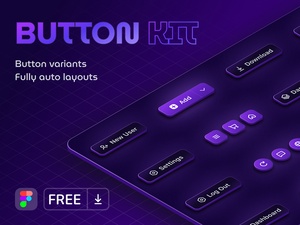
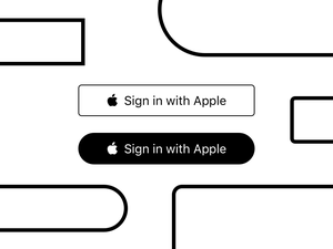
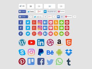
This Figma UI kit offers a comprehensive collection of customizable buttons, perfect for enhancing your website or app interfaces. Let's delve into its key features:
Effortless Customization:
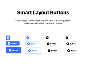
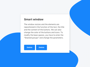
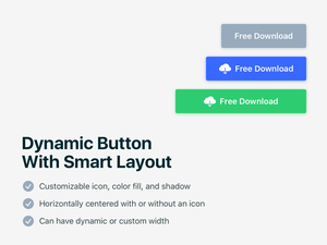
- Auto Layout: Modify button sizes, colors, and text seamlessly with the power of Auto Layout. This feature ensures your buttons adapt flawlessly to any design adjustments.
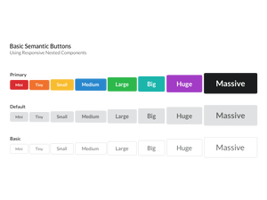
- Variety of Shapes and Sizes: Explore a diverse range of button shapes and sizes within the kit, catering to various design aesthetics and functionalities.
- Flexibility: Whether you need sleek buttons for a minimalist interface or bold calls to action, this kit provides the building blocks to achieve your vision.
Benefits:
- Save Time: Skip the tedious process of designing buttons from scratch. This kit equips you with ready-made elements to accelerate your workflow.
- Maintain Consistency: Achieve a cohesive and polished look across your interface by utilizing the consistent design language of the button kit.
- Elevate User Experience: Craft intuitive and visually appealing interfaces that enhance user engagement and satisfaction.
Gratitude:
A special thanks to Di Smolskii for generously sharing this valuable resource with the design community.
Additional Considerations:
- Explore the kit to discover the full extent of its customization options and button styles.
- Experiment with different combinations of colors, shapes, and sizes to find the perfect fit for your project.
- Leverage the kit as a foundation to build upon and create unique button designs that align with your brand identity.


