Bootstrap 4 Grid System
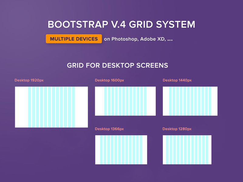
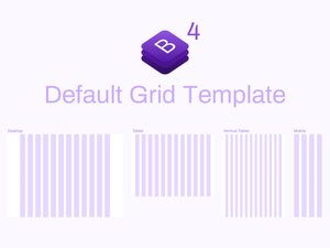
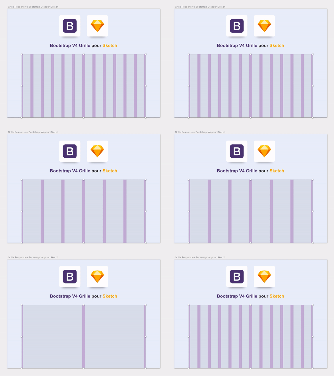
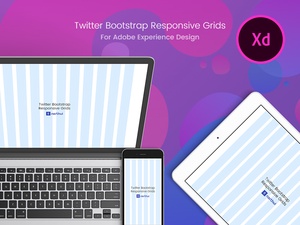
The design community is forever grateful to Huy Tu for providing a freebie bootstrap 4 grid system useful for creating multiple device screen sizes on Photoshop, Adobe XD, Figma, and png images. This grid system makes it easy to design responsive layouts tailored to different devices, ensuring a consistent look and feel across all platforms.
It eliminates the need to manually adjust the sizes of individual elements, which can be a time-consuming and tedious process. With this grid system, the entire design process is streamlined, allowing designers to quickly create stunning, seamless layouts. Additionally, the provided templates are compatible with all major design tools, making it easy to switch from one to another without any compatibility issues.
This grid system has revolutionized how we create designs for multiple device screen sizes. It has allowed us to create stunning designs with minimal effort, eliminating the need for manual adjustments. Furthermore, the templates are compatible with all major design tools, making it a great choice for designers of all skill levels.
We can't thank Huy Tu enough for providing this amazing grid system to the design community. Not only has it made it easier for us to create beautiful designs, but it has helped us save time and money. We are so grateful for this wonderful resource and are excited to see what else Huy Tu has in store for the design community.
 The design community is forever grateful to Huy Tu for providing a freebie bootstrap 4 grid system useful for creating multiple device screen sizes on Photoshop, Adobe XD, Figma, and png images. This grid system makes it easy to design responsive layouts tailored to different devices, ensuring a consistent look and feel across all platforms.
It eliminates the need to manually adjust the sizes of individual elements, which can be a time-consuming and tedious process. With this grid system, the entire design process is streamlined, allowing designers to quickly create stunning, seamless layouts. Additionally, the provided templates are compatible with all major design tools, making it easy to switch from one to another without any compatibility issues.
This grid system has revolutionized how we create designs for multiple device screen sizes. It has allowed us to create stunning designs with minimal effort, eliminating the need for manual adjustments. Furthermore, the templates are compatible with all major design tools, making it a great choice for designers of all skill levels.
We can't thank Huy Tu enough for providing this amazing grid system to the design community. Not only has it made it easier for us to create beautiful designs, but it has helped us save time and money. We are so grateful for this wonderful resource and are excited to see what else Huy Tu has in store for the design community.


