Bank App Concept
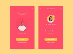
Today, I'm excited to discuss a bank app UI I recently discovered in Figma. It was beautifully designed by Shirish Shikhrakar and is available for free.
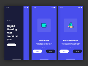
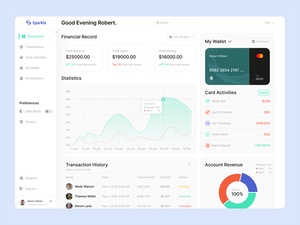
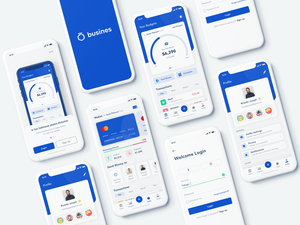
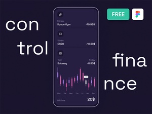
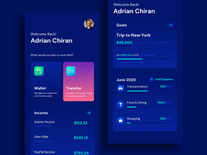
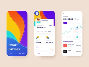
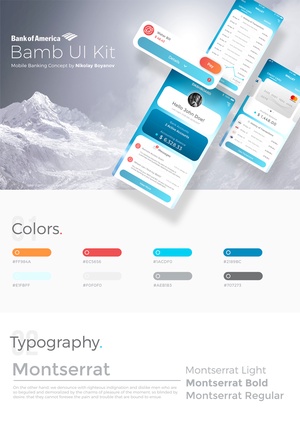
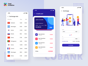
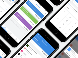
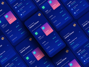
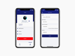
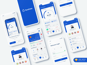
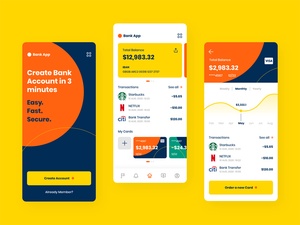
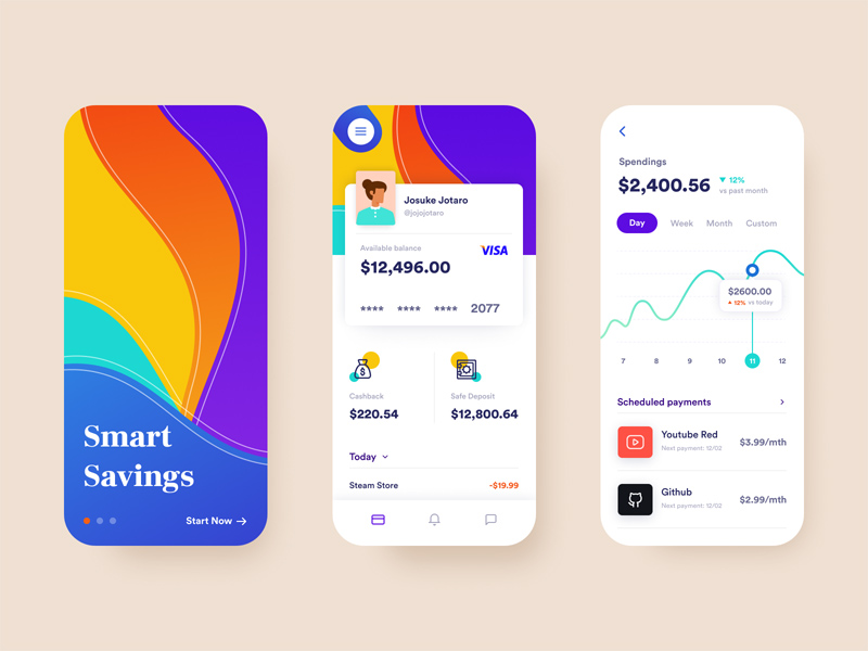
The user interface instantly caught my attention with its sleek and vivid colors. The layout is uncluttered and easy to navigate. All the necessary elements are present, including a search bar, navigation menu and a few action buttons. The text is easy to read, with plenty of white space to keep things organized.
What I find most impressive is the creativity and attention to detail. There is an effortless flow from one page to the next and the colors are used to great effect. For example, the deposit page has a vibrant green background to give it a sense of security.
Overall, I'm very impressed with this bank app UI. It shows what can be accomplished with thoughtful and creative design. I'm sure that users will appreciate the clean and vibrant look and feel of this design. Many thanks to Shirish Shikhrakar for sharing this UI freebie!
 Today, I'm excited to discuss a bank app UI I recently discovered in Figma. It was beautifully designed by Shirish Shikhrakar and is available for free.
The user interface instantly caught my attention with its sleek and vivid colors. The layout is uncluttered and easy to navigate. All the necessary elements are present, including a search bar, navigation menu and a few action buttons. The text is easy to read, with plenty of white space to keep things organized.
What I find most impressive is the creativity and attention to detail. There is an effortless flow from one page to the next and the colors are used to great effect. For example, the deposit page has a vibrant green background to give it a sense of security.
Overall, I'm very impressed with this bank app UI. It shows what can be accomplished with thoughtful and creative design. I'm sure that users will appreciate the clean and vibrant look and feel of this design. Many thanks to Shirish Shikhrakar for sharing this UI freebie!


