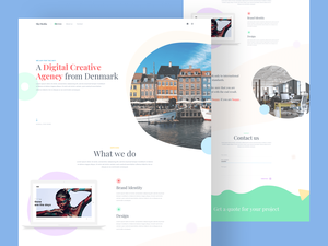
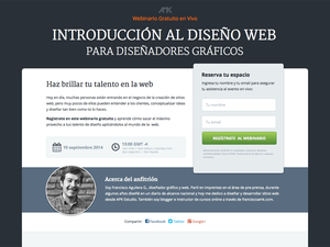
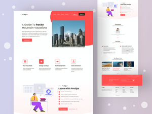
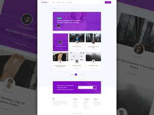
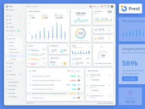
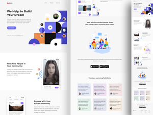
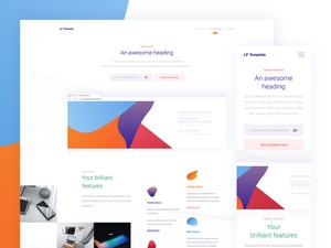
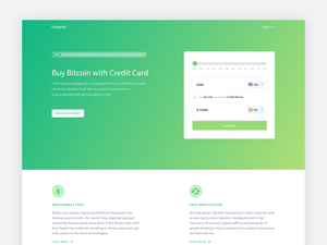
デジタルデザインエージェンシーのウェブサイトテンプレート(Zebb)
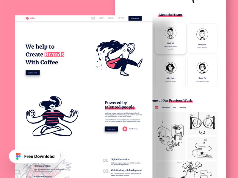
Designing a digital agency website template involves a systematic and creative process to ensure the final product effectively showcases the company’s expertise and services while providing an engaging and intuitive user experience. Below is a detailed work process for achieving this:
1. Research and Planning
- Understand the Client’s Needs: Begin by gathering information about the client’s goals, target audience, and the services they offer. This will guide the design direction.
- Competitor Analysis: Study competitors' websites to identify trends, strengths, and gaps that can be addressed in your design.
- Define Structure and Content: Outline the site’s structure, including the main pages (Home, About, Services, Portfolio, Blog, Contact, etc.). Plan the content hierarchy to ensure clarity and ease of navigation.
2. Wireframing
- Create Basic Layouts: Use tools like Figma to create wireframes that outline the basic structure of each page. Focus on the placement of key elements like the header, footer, navigation, call-to-action buttons, and content sections.
- User Flow Considerations: Ensure the wireframe reflects an intuitive user journey, guiding visitors smoothly from one section to another.
3. Design and Branding
- Apply Visual Style: Begin applying the visual style, including color schemes, typography, and imagery that align with the company’s branding.
- Design Key Pages: Focus on the homepage first, as it sets the tone for the rest of the site. Ensure it highlights the agency’s unique selling points, services, and portfolio.
- Responsive Design: Design with responsiveness in mind, ensuring the template works well on various devices (desktops, tablets, and smartphones).
4. Prototyping
- Interactive Prototypes: Use Figma to create clickable prototypes that simulate how the website will function. This helps in visualizing the user experience and refining the design.
- Feedback and Iteration: Share the prototype with stakeholders to gather feedback. Iterate on the design based on the input received to enhance user experience and satisfaction.
5. Final Design
- Polish the Details: Finalize all elements, ensuring consistency in spacing, alignment, and overall aesthetic. Add any additional interactive elements like hover effects or animations.
- Prepare Design Assets: Export all design assets (icons, images, fonts) and organize them systematically for easy development handoff.
6. Handoff to Development
- Provide Design Specifications: Use Figma’s design handoff features to share detailed specifications with the development team, including measurements, color codes, and font details.
- Collaborate with Developers: Work closely with the development team to ensure the design is implemented as intended, providing guidance on any complex elements.
7. Testing and Launch
- Usability Testing: Conduct usability tests to identify any potential issues in navigation, responsiveness, or functionality.
- Refinements: Make necessary adjustments based on test results to ensure a smooth user experience.
- Launch: Once the website passes all tests, prepare for launch. Ensure all pages are optimized for performance and SEO.
8. Post-Launch Review
- Monitor User Feedback: After launch, gather user feedback and analytics to identify areas for improvement.
- Continuous Updates: Regularly update the website to keep content fresh and the user experience optimal.
Thanks to Al Razi Siam for Sharing the Figma Freebie!
Special thanks to Al Razi Siam for providing the Figma freebie that served as a foundation for this process. His contribution made it easier to craft a professional and visually appealing digital agency website template.
This structured approach ensures that the final website is not only visually striking but also functional, user-friendly, and tailored to the needs of the agency and its clients.


