Travel App UI made in Figma
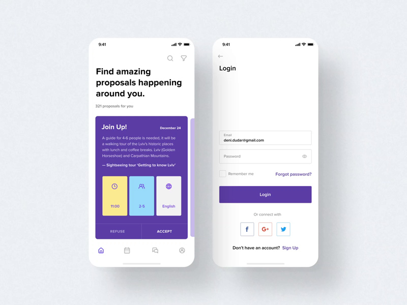
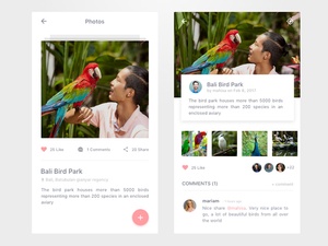
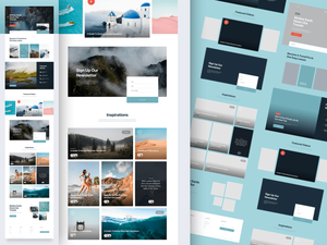
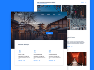
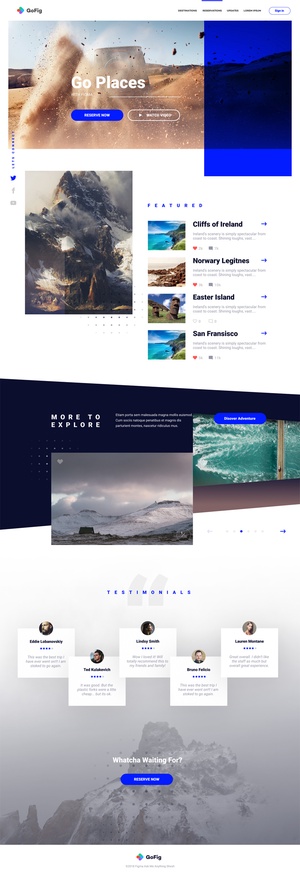
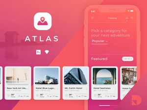
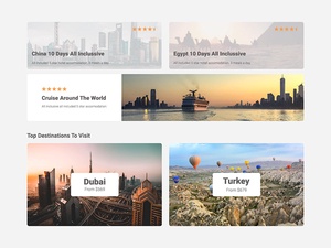
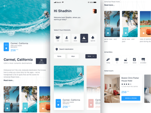
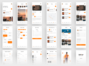
Traveling to a new city can be both exciting and intimidating. As such, a user-friendly and intuitive travel app can make all the difference for those looking to navigate a new city with ease. This City Travel App UI concept does just that, with a clean and bright design that makes discovering new cities a breeze.
The interface is easy to navigate and provides all the necessary information at a glance. For example, the home page features a map view of the city, with various points of interest clearly marked. This makes it easy to locate nearby attractions and plan a route. Additionally, the app also offers quick access to public transportation information and weather updates, allowing users to plan ahead and make the most of their time in the city.
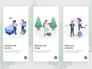
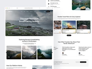
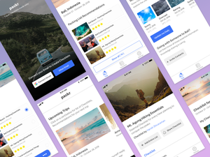
The design of the app is also a huge plus. Thanks to its bright and modern look, the app feels inviting and fun to use. Plus, its use of simple shapes, vivid colors, and clear typography make it easy to read and understand.
Overall, this City Travel App UI concept is an excellent example of how a great design can make a travel app more enjoyable to use. With its intuitive interface and modern look, this app offers a great way to explore any new city. Thanks to Den Dudar for sharing this Figma freebie!
 Traveling to a new city can be both exciting and intimidating. As such, a user-friendly and intuitive travel app can make all the difference for those looking to navigate a new city with ease. This City Travel App UI concept does just that, with a clean and bright design that makes discovering new cities a breeze.
The interface is easy to navigate and provides all the necessary information at a glance. For example, the home page features a map view of the city, with various points of interest clearly marked. This makes it easy to locate nearby attractions and plan a route. Additionally, the app also offers quick access to public transportation information and weather updates, allowing users to plan ahead and make the most of their time in the city.
The design of the app is also a huge plus. Thanks to its bright and modern look, the app feels inviting and fun to use. Plus, its use of simple shapes, vivid colors, and clear typography make it easy to read and understand.
Overall, this City Travel App UI concept is an excellent example of how a great design can make a travel app more enjoyable to use. With its intuitive interface and modern look, this app offers a great way to explore any new city. Thanks to Den Dudar for sharing this Figma freebie!


